Use the primary logo whenever possible. This is the logo that will be used across brand applications, such as stationery, digital assets, and promotional products. It is essential to the success of the brand that the logo always be applied with care and respect in every application, according to these guidelines.
Secondary Logo
This is the logo that will be used across brand applications, such as stationery, digital assets, and promotional products. It is essential to the success of the brand that the logo always be applied with care and respect in every application, according to these guidelines.
Clearspace
To ensure legibility, always keep a minimum clear space around the logo. Use the letter “T” in “THE” from the logo at a 100% ratio. This space locates the mark against any competing graphic elements, like other logos or body copy that might conflict with, overcrowd, or lessen the impact of the mark.
Minimum Size
The primary logo should be represented no smaller than 1” wide. The secondary logo should be represented no smaller than 1.45” wide.
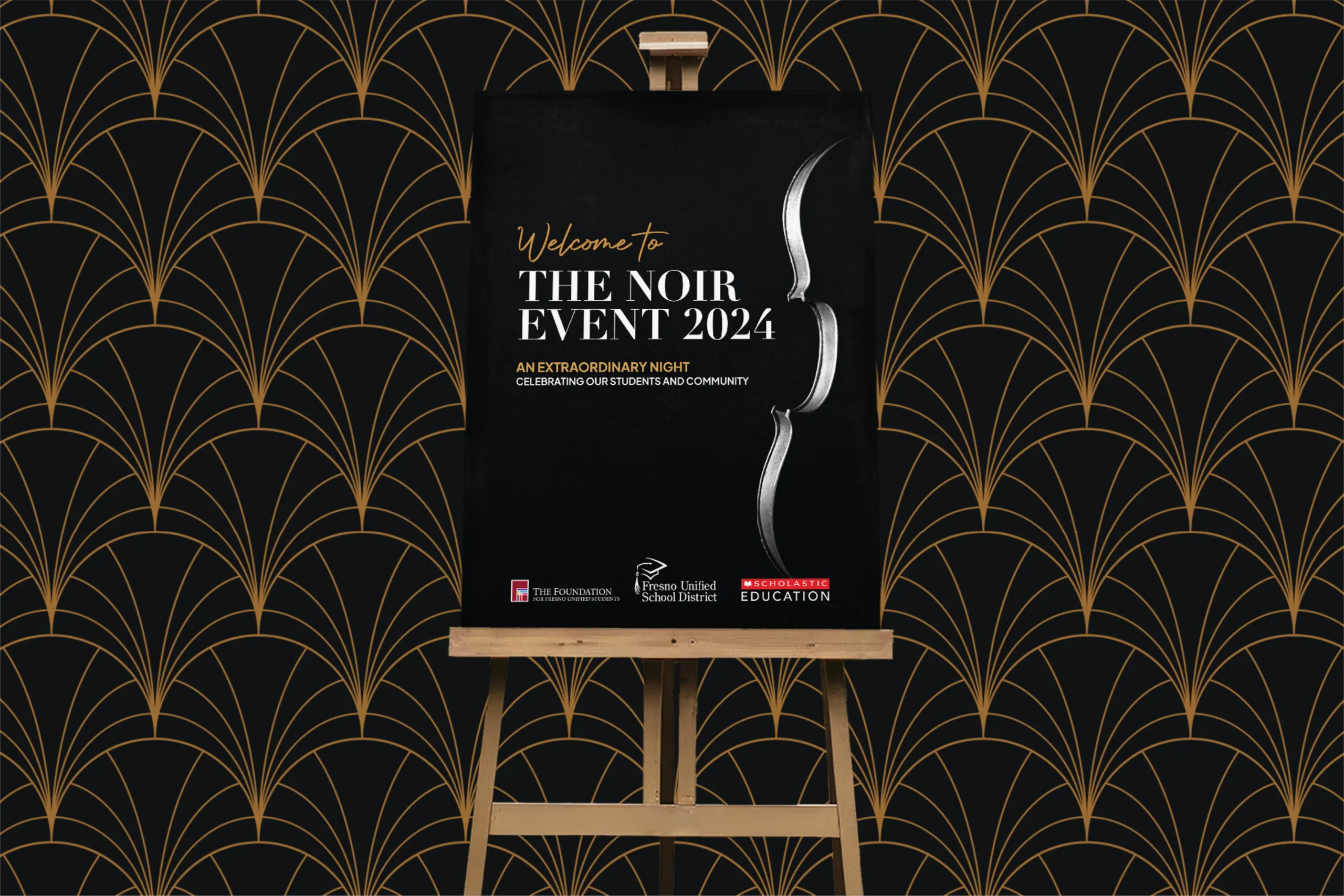
Logo Usage
Use the primary logo whenever possible.
Use the primary logo on light background colors.
Use the inverse or white one-color logo on dark colors
Photo Background
There are many ways the logo can be used on photographic backgrounds, but each option should be exercised with care, ensuring that the logo and type aren’t obstructed by the image. In most cases, using the reverse of the primary logo should give enough contrast.
Tips:
1. Photos with shallow depths-of-field work best.
2. Avoid busy images with too much detail.
3. Avoid covering faces.
4. Applying a dark, 20-30% transparent overlay on an image helps to make the logo more legible.
Full-Color Logo on Dark Image Background
Inverse Logo on Dark Image Background
Misuse
Don’t use off-brand colors. Please reference the color usage section.
Don’t rotate the logo.
Don’t skew or distort the original dimensions.
Don’t remove any elements of the logo.
Don’t rearrange any elements of the logo.
Don’t apply drop-shadows, glows, or any unflattering effects to the logo.
Don’t use color versions of the logo on darker colored backgrounds.
Don’t use any version of the logo on low-contrast backgrounds.
Avoid using background tones similar to the colors in the logo.
Placement
Primary Logo Placement
Due to the primary and secondary logo compositions, the logo must only be placed on the left side of a layout, not the center or right. This example shows the logo aligned to the left in a one-column layout.
Secondary Logo Placement
Due to the primary and secondary logo compositions, the logo must only be placed on the left side of a layout, not the center or right. This example shows the logo aligned to the left in a one-column layout.
This font is to be used for main headings at “SemiBold” font-weight. This font is to be used for sub-headings at “Bold” font-weight. This font is to be used for body copy at “Regular” font-weight.
Uppercase
a b c d e f g h i j k l m n o p q r s t u v w x y z
Lowercase
a b c d e f g h i j k l m n o p q r s t u v w x y z