Overview

Overview

Organization Info

Organization & Initiative

Power of One

Logo

Variations

Primary Logo

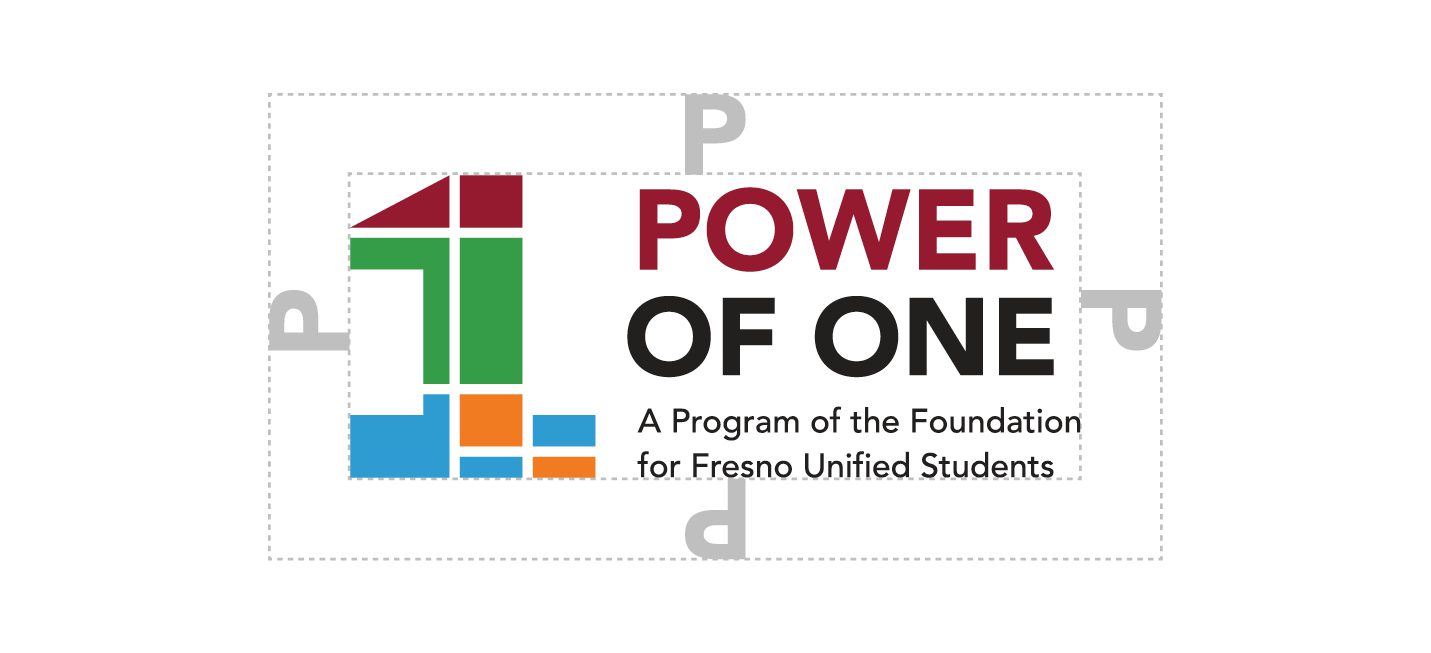
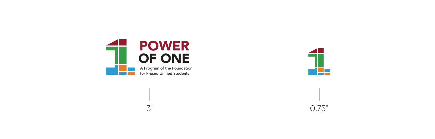
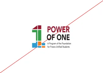
Use the primary logo whenever possible. This is the logo that will be used across brand applications, such as stationery, digital assets, and promotional products. It is essential to the success of the brand that the logo always be applied with care and respect in every application, according to these guidelines.

Secondary Logo (Without Tagline)

This is the logo that will be used across brand applications, such as stationery, digital assets, and promotional products. It is essential to the success of the brand that the logo always be applied with care and respect in every application, according to these guidelines.

Logomark

This element should be used by itself only when space constraints are paramount. The preferred logo usage is the wordmark with the logo lockup.

Clearspace

To ensure legibility, always keep a minimum clear space around the logo. Use the letter “P” in “Power” from the logo at a 100% ratio. This space locates the mark against any competing graphic elements, like other logos or body copy that might conflict with, overcrowd, or lessen the impact of the mark.

Minimum Size

The primary logo should be represented no smaller than 1.5” wide. The wordmark should be represented no smaller than 1.5” wide. The logomark should be represented no smaller than 0.5” wide when used individually.

Logo Usage

Use the primary logo whenever possible.

Use the primary logo on light background colors.

Use the grayscale logo when color isn’t available.

Use the inverse or white one-color logo on dark colors.

Photo Background

There are many ways the logo can be used on photographic backgrounds, but each option should be exercised with care, ensuring that the logo and type aren’t obstructed by the image. In most cases, using the reverse of the primary logo should give enough contrast.

Tips:

  1. Photos with shallow depths-of-field work best.
  2. Avoid busy images with too much detail.
  3. Avoid covering faces.
  4. Applying a dark, 20-30% transparent overlay on an image helps to make the logo more legible.

White or Inverse Logo on Dark Image Background

Misuse

Don’t use off-brand colors. Please reference the color usage section.

Don’t rotate the logo.

Don’t skew or distort the original dimensions.

Don’t remove any elements of the logo.

Don’t rearrange any elements of the logo.

Don’t apply drop-shadows, glows, or any unflattering effects to the logo.

Don’t use color versions of the logo on darker colored backgrounds.

Don’t use any version of the logo on low-contrast backgrounds.

Avoid using background tones similar to the colors in the logo.

Placement

Primary Logo Placement

Secondary Logo

Logomark